They say that first impressions count. The first thing a customer notices about a company is often its sign, so it’s essential that your sign conveys every important, unsaid detail that you want to relay to your client.
In order to create a good impression, a sign must stand out from the crowd. However, its all too easy to make design mistakes that will highlight your sign for all the wrong reasons.
But fear not. We’re here to flag up those common design flaws that trip up even the best of us. Here’s what to avoid:
1. Too much information…
Yes, there’s such a thing as too much information. It’s important to give passers by an idea of what your company is about. However, too much writing on a sign and people will quickly lose interest. It’s estimated that signs viewed by passing motorists have a lifespan of only 3½ seconds! That’s why it’s best to keep words to a minimum (seven or less).
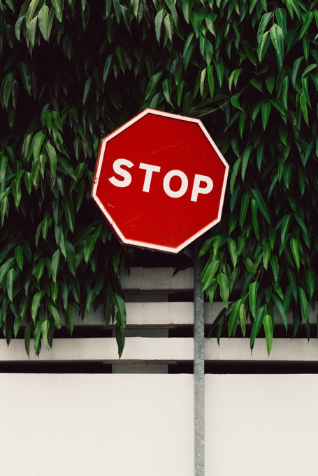
2. Not choosing colours that compliment each other
Choose separate colours for your background and your text, ensuring that your colours contrast enough so that your text stands out. But make sure that the contrasting colours don’t clash – for example, blue and green should never be seen!
3. Uneven Spacing
Make sure you measure up first! Signs look clumsy and unprofessional if the letters start with equal spaces between them but end looking cramped. This mistake could also lead to you not being able to fit all of the letters onto your sign, making it nonsensical.
4. Choosing the wrong font
Make sure your font is legible and stands out. Also make sure that each of your letters are a decent size and that your sign doesn’t require people squinting at it in order to read the words.
5. Forgetting to spell check
It may seem obvious, but make sure that all of the words on your sign are spelt correctly and that your sentences make grammatical sense! Many signs have been ruined by a misplaced comma or apostrophe!
6. Overcomplicating artwork
Any images on signs should be clear enough that the passer by could view it within 3½ seconds. Your audience will often overlook any overcomplicated drawings that take time to analyse. Try and stick to a clear and simple logo.
7. Picking the wrong material
You must consider your sign’s location when choosing material. For example, acrylic letters will last a long time in an outdoor environment, but they are not impact resistant.