The signage which advertises your business to the world and welcomes newcomers to the premises is one of the most essential assets you can invest in. Not only it is practically important in letting your customers know where your offices are located, it also serves another, more subconscious purpose; that of consolidating your brand and image.
As the first thing a prospective client sees when approaching your business, it’s vital you make an outstanding impression. Therefore, getting the design right on your custom signage is absolutely imperative – this simple checklist should aid you in making the right choices to turn customers’ heads, earn their trust and keep them coming back for more.
Purpose
What do you want your sign to do? Simply advertise your business and no more? Alert new customers to your presence? Market a new promotion you’re trialling? The specific function of your custom sign will affect all aspects of it, from its size and shape to the materials used and the location it’s placed in.
Positioning
Taking into account the desired purpose of your sign, you should now be better equipped to decide where it will be positioned. This, again, will affect its size and materials, as it may be open to the elements and require hardier substances, or exposed to humidity, heat or other variable factors.
Size
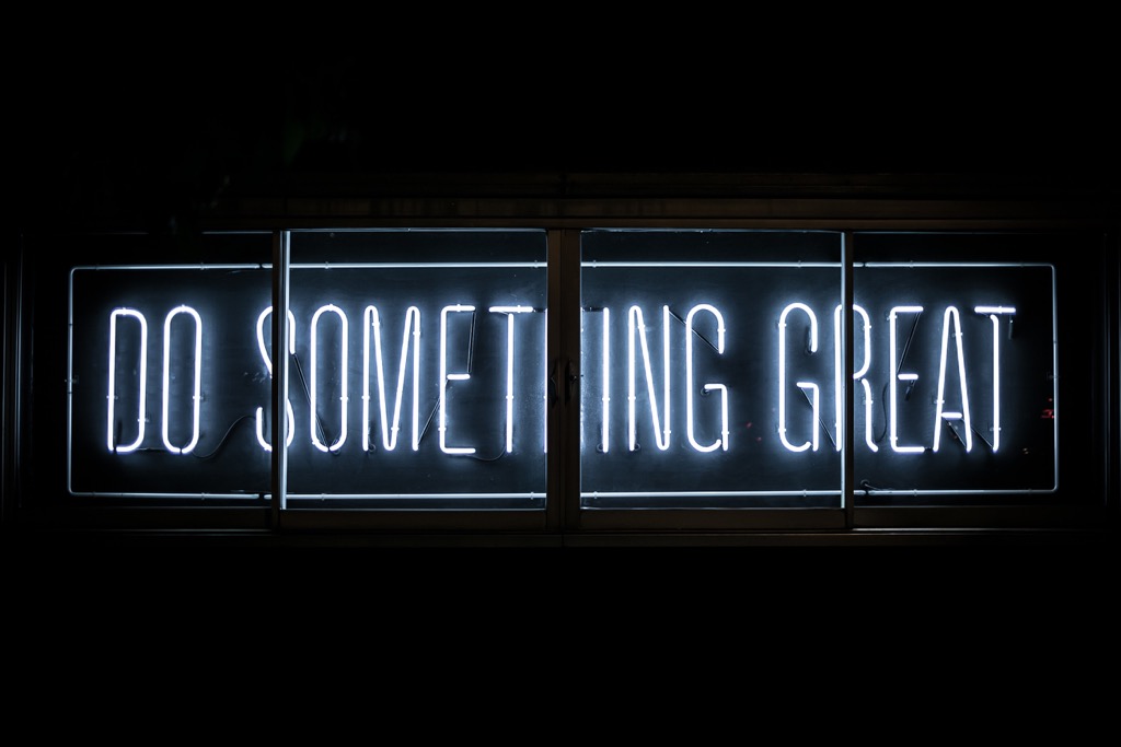
It sounds simplistic, but size does matter when it comes to signage. Simply put, the larger your lettering or logo, the more legible and instantly recognisable it will be from further away, thus multiplying the number of people it is capable of reaching. Of course, this is not true for all signs, as those in the interior of a building or which aim for a more refined and understated look may prefer a smaller size.
Materials
If you’re looking for a sense of permanence and stability with your sign, a durable material is preferable. If you are only interested in promoting a specific deal or one-off event, something cheaper might be better. Think back to the purpose of your sign when choosing its materials.
Colours
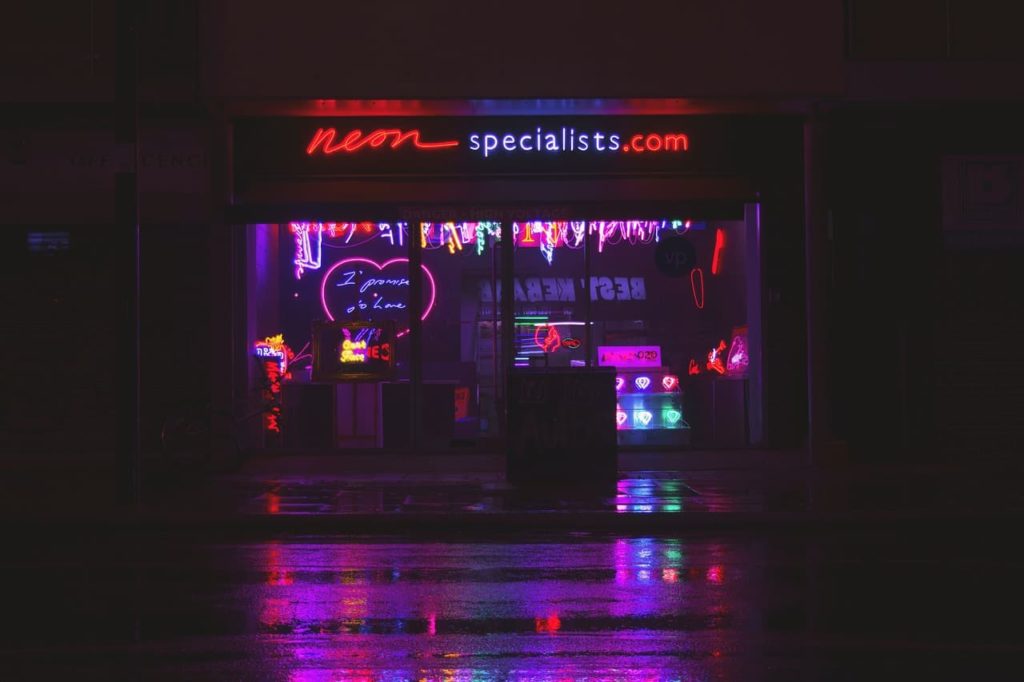
Without a doubt, the most important element of your signage are the colours you use. Think of the instant association we subconsciously make between McDonalds and yellow and red, for example. If your brand already has a logo with a recognisable colour scheme in place, it’s best to use that again; if not, you’ll need to think long and hard about which ones to use. Once you’ve landed upon a set of colours, it will be very difficult to change them, so make sure you’re happy with your selection.
Contrast
Contrast is important for both facilitating legibility and increasing memorability. Going back to the example of McDonalds, their signage is so iconic precisely because the red and yellow clash; you might want to try something similar for your own brand. Again, something so brazen isn’t for every business, and more sophisticated outfits might opt for a more delicate contrast, but even so, different colours (or even hues) do complement each other well.
Font
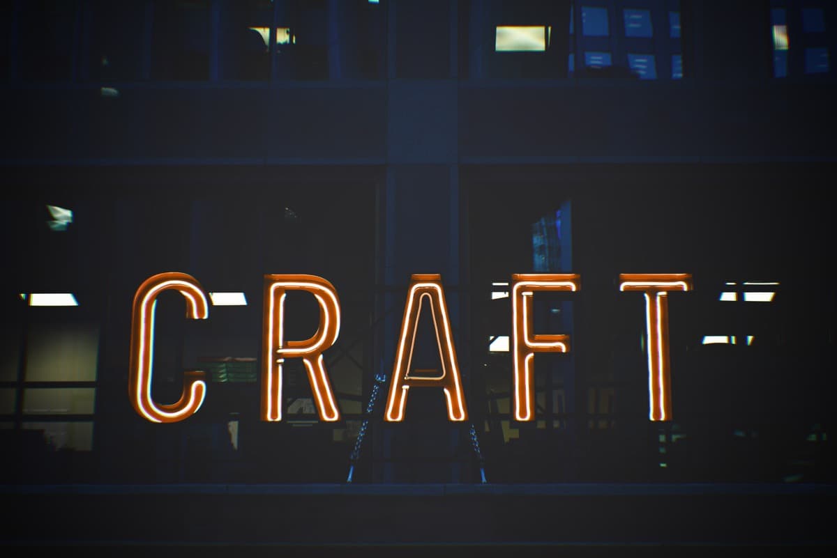
You might be tempted to go for a flowery or calligraphic font when designing the lettering on your logo, but be mindful that this can make it more difficult to read. With that in mind, a simple, easily legible typeface might not be as glamorous but could prove a better option in terms of communicating your message, which is the most important element of any sign.
Enlist professional help
Designing a custom corporate sign can represent a tricky challenge if it’s not your area of expertise. Why not let the professionals help you out? At Afrisign, we have over 12 years’ experience in creating signage for businesses all over Cape Town and beyond. Get in contact with us today to find out how we can help you and your business design the signage that’s right for them.